Through this week I was able to learn new information regarding motion design. I was able to understand and make connections between the past inventions regarding optical illusions of movement and the basis of modern animation. I also learned the actual terminology to principles that I follow within my own motion design, like primary and secondary motion or linear and non-linear velocity. Even though I have experience in motion design, and I was familiar with most of this information, the readings allowed me to get more familiarized with terminology and the history of the field.
Skills and Concepts Learned
Academic
Occupational
Technical
Motion paths – predetermined paths dictating the movement of an element
Dynamic Digital Signage – network that utilizes a server to broadcast visual information
Conceptual
Primary Motion – The movement of elements in space Secondary Motion – The movement of the camera in space Linear Velocity – motion without acceleration or deceleration. Non-linear velocity – Movement that accelerates or decelerates to make animation feel more natural Route – The direction an element travels Arcs – circular paths of movement
Immersive Environments – Environments that merge imaginary and physical environments through the use of motion design
On the Design Research Class we began to work on a place branding project that will extend into some of our upcoming classes. During this month I focused on choosing an area close to me that would benefit from branding, conducted in-depth research of the location, and compared it to its closest competitors in order to find a strong differentiation in which to work and promote. Through these activities, I was able to gather important information that will work as a foundation for my future design decisions as this project unfolds.
The first step on this project was to choose a place to brand. When researching the neighborhoods and areas around my residence I kept in mind the five principles of place branding. These principles express that good place branding is distinctive, authentic, memorable, co-created, and express a sense of place. In order to meet these principles I started looking for areas that seemed to be different from its surroundings, that had businesses or locations that would be good resources of research, that had the potential of providing unique experiences, and had a strong sense of community and core values. This search led me into selecting the historical neighborhood of Hannibal Square in Winter Park, Florida.
The next step was to conduct research in order to start finding the brand equity of the area. On this step we decided to start by conducting secondary research, which according to Emily Esposito it takes place “when you use existing data like books, articles, or the internet to validate or support existing research” (Esposito, 2018). Here I used search engines to research on the history of the area and its culture. At the end of this research I was able to conclude that Hannibal square has high equity within its residents. This area has the highest African American population in all of Winter Park(cochse@rollins.edu, 2014). It has a Heritage Center promoting the African American history of the area (Miller). It also has a Community Center, luxury apartments, fine dining, spas, and boutiques which attracts residents from all around Winter Park expanding its equity outside of its own boundaries (Miller). On the second part of this step I needed to go to Hannibal Square in order to take photographs reflecting these findings. During this step I visited the Hannibal Square Heritage center which organically led me into conducting some primary research when speaking to a volunteer. Emily Esposito describes this as “going directly to the source (your customers) to ask questions and gather data” (Esposito, 2018). The information I found through primary research and my close observations of the neighborhood directed me into realizing that there was a clear differentiation within Hannibal Square itself. There was a clear line of difference, both economic and cultural, between the historical African American side of the neighborhood and the high end apartments and businesses side.
Historic African American Side of Hannibal Square
Luxury Apartments and Businesses Side of Hannibal Square
The goal of the last step of conducted research was to find a big differentiator between the chosen area and its close competitors. This big differentiation will be our “Zag”, as explained by Marty Neumeier, it will be help our brand stand out from its competitors (Scanlon, 2006). In order to find the Zag of Hannibal Square I decided to conduct a comparative analysis between its Historical African American side (West Hannibal Square), its luxury side (East Hannibal Square), and its closest competitor the Historical African American district of Etonville. The differences between the west and east sides of Hannibal square were easily identifiable because of the luxury business of the East side, yet there were similarities encountered. Not all of the west of Hannibal Square has changed. New England Avenue (the luxury area of Hannibal Square) is still surrounded by churches, homes, and lodges that express the African American history of the area.
Hannibal Square and Eatonville both have their rich African American history as a similarities. Both areas promote heritage based community activities. African American churches and businesses can be found on both areas. In contrast Hannibal Square seems to be more open to the rest of its surrounding community. Plenty of visitors from the west side of Hannibal Square, the rest of Winter Park, and surrounding cities visit both the Community Center and Heritage center to enjoy the recreational and community activities hosted in these two buildings (Miller). This inclusion of neighboring visitors gives west Hannibal Square a sense of ethnic and socioeconomic diversity. Eatonville on the other hand celebrates its own history more privately by promoting cultural activities unique to the area. The biggest attractions in Eatonville are Zora Neal Hurston National Museum of Fine Arts, which is dedicated to a historic local author, and their library (Padgett & Sholl, 2018).
The biggest differentiator in West Hannibal Square is that it is a historical African American neighborhood that is inviting of its neighboring visitors. It is active with its surrounding community, and eager to teach others of its rich history. Plenty of visitors of different ethnicities and socioeconomic status can be seen in West Hannibal Square because of the recreational and cultural activities it provides.
The biggest design problem presented during the research was the difference in culture found within Hannibal Square. The East side of Hannibal Square is completely different to the west side because of its businesses and apartments on New England Avenue. In order to solve this problem I could choose to incorporate this culture found in New England Avenue into the branding of Hannibal Square in some way, or Separate Hannibal Square into two and then choosing to brand just one of the sides. As of now I have decided to work on branding the west side of Hannibal Square, since I see that its history and its community building activities are a stronger message to communicate.
Images of Visitors, and Community Activities Hosted at the Heritage Center and Community Center
The biggest difference between my process of research compared to that normally used on the industry were the steps taken when collecting research. According to Emily Esposito, when conducting design research one normally starts with primary research, then one moves into secondary research in order to learn more about the findings from the primary research (Esposito, 2018). In this particular case I started conducting secondary research, by first finding information on Hannibal Square’s history. This secondary research organically led me into primary research, which changed my views on the location. While starting with secondary research instead of primary research was not innovative in any way, i feel that it affected and altered my work. When I posted my findings of my secondary research I saw Hannibal Square as a very diverse historical neighborhood with luxury apartments, shops, and recreational offerings. After conducting primary research I noticed that there was a clear line of differentiation between the historical Hannibal Square and the luxury Hannibal Square, and a choice in branding needed to be taken.
Important skills and Concepts learned
Academic
Occupational
Technical
Comparative analysis– A process utilized to find similarities and differences between similar brands Competitive analysis – A process to find out what a competitor is working on Pure research – conducting research revolving an initial idea Applied research – Used to solve a problem through practice
Primary research – interviewing the client, competition, and consumers Secondary research – utilizing web searches, data bases, books or articles for research Evaluative research – research and evaluate usability or interaction of a product Design research – Seeing a problem from different angles to acquire creative and unique solutions Quantitative research – based on statistics and factual numbers Qualitative research – Based on observable insight
Conceptual
Genius loci– Its the process of building a sense of place. Principles of place branding – distinctiveness, authenticity, memorability, co-creation, and the experiential sense of place Zag – a radical differentiator that helps a brand stand out Brand differentiation – The key differences between similar brands that makes them unique.
Immersion stage – researching the client Discovery stage – interacting with the client Equity – composed of brand loyalty, awareness, associations, and quality
On the Effective Copywriting class we created marketing campaigns for selected non-profit organizations. I chose to work with the Elephant Sanctuary in Tennessee. This non-profit’s goals are to retire elephants from circuses and zoos, provide them with a sanctuary where the animals can create a community, and teaching others through distance learning of the importance of respecting wildlife and ending elephant captivity (The Elephant Sanctuary in Tennessee). Through research on the sanctuary, I saw that it was important to focus the campaign on persuading the target audience into becoming members of the sanctuary in order to be active volunteers and donors.
The first step into developing the campaign was to find the target audience. In order to achieve this I created two target audience profiles. The first one was Mary, a teenager with the goal of working with animals as a career. This type of audience would be targeted for their need to volunteer and get experience in their desired field. The tone used to target Mary would need to be young and relatable. The second persona was Mike, a young traveler that enjoys having new experiences. Audiences similar to mike would be targeted by presenting them new experiences through volunteering, and informing them on the good their work does for these animals. The tone used for Mike would have to be loose and modern, yet appropriate to his age. By utilizing the target audience profiles as a guide throughout my process I was able to avoid self-referential design, and find out which of Settle and Alreck’s 15 Catalog of Needs I should use on my campaign ads (Felton, 2013).
Next came the developing of ads for the campaign. I started by creating six sketches based on the George Felton’s nine types of testimonials. The first sketch was based on the celebrity testimonials (Felton, 2013). Through research of the Sanctuary I learned that the first elephant named Tarra was a celebrity animal that worked on television, movies, circuses, and zoos. After being retired it became famous once again because of a viral video of its friendship with a dog (The Elephant Sanctuary in Tennessee).
The second was based on a president type testimonial (Felton, 2013). Here I used the words of the sanctuary’s president from 2010 where he stated that “the philosophy, goals and vision of the sanctuary will continue to be honored and kept intact. It’s all about the elephants” (Lewis County Herald, 2010)
The third sketch was based on the wrong person category (Felton, 2013). Here I utilized the scenario of how the people that work on a circus would feel after having their elephant retired. I thought that perhaps the clowns and other performers would have to work double in order to fill the elephant’s act. Following this train of thought I used the words of a sad and tired clown as my testimonial.
My fourth sketch was based on the historical figures/unreal people category (Felton, 2013). Here I used a current event of a baby elephant being worked to death in a zoo in Thailand. Utilizing the baby elephant as the testimonial helped to pull heartstrings.
The fifth sketch was based on the just plain folk category (Felton, 2013). Here I utilized the online review of a young volunteer as the testimonial. I made sure that this volunteer utilized the right tone on her review in order to make her relatable to the target audience.
The last sketch was based on the not the person but the thing category (Felton, 2013). After finding out that the sanctuary utilizes solar powered cameras to provide a live feed of the elephant’s daily lives for distant learning, I decided to utilize the camera as my subject for the testimonial. This would give the ad a playful, fun style if utilized well.
After making my sketches, I chose the best three and developed them further. I decided to create three comps for criticism from my professor. The first one I chose was the one based on Tarra the elephant, because of her virality on social media and her importance as the first elephant taken into the sanctuary. Her having a background as a celebrity animal would be a good testimonial used to reach the target audience. When developing the comp, I started thinking on the design aspects. I decided to utilize colors and fonts used on the sanctuary’s website in order to create an organic transition for the target audience as they navigate from the printed ad to the website.
The second comp was based on the testimonial of Dumbo, the baby elephant that died on a zoo. This story being a current event was very effective in pulling heartstrings. The story would be relatable and easily shareable through social media reaching the desired target audience.
The last comp was based on the sketch of the camera as a testimonial. The playful nature of this ad made it worth to experiment with and to utilize. It also gives information on a unique service that the sanctuary provides.
The next step came after receiving feedback. I decided to base the campaign’s look and feel on the comp of Tarra’s testimony since it was the most successful one. I tweaked the colors and formatting of the text to make the transition between the ad and the website more organic. Lastly, I went over the copy to make sure that it delivered the right message.
For the comp based on the story of Dumbo, it was pointed out that the image did not mirror the story and that it was too similar to the ad based on Tarra. This guided me into finding a photograph of a baby elephant in chains on the floor. It being a perfect mirroring of the story it was implemented into the design. The formatting of the design elements and type was also changed to match the new campaign look and feel.
Lastly, the third comp had the problem that the image chosen gave a feeling of being watched rather than watching. This forced me to go back to brainstorming. After trying many different approaches, like utilizing the image of the elephants reflected on a camera lens, or having the camera and the elephants on same photograph; I decided to represent the screen where the audience would be watching the elephants. This guided me into adding a screen overlay over a photograph of elephants playing, mirroring the act of the target audience studying the elephants from their own screens. Lastly, i changed the design and text format to match the campaign.
Through this process I was able to understand the importance of researching, and knowing your target audience when working on a campaign. All aspects of the design need to be based on this information, since ultimately the goal is to persuade these consumers into buying the product or service that your client provides. Creating personas not only helps you understand your target audience, but also prevents self-referential design, which it is a trap that could make any campaign ineffective.
Researching you client is also extremely important. It’s history, employers, employees, vision, and missions can provide valuable information for writing effective copy. This is also connected to the research of the client’s competition. Finding unique aspects in your client that are not found on the competition are the best resources for writing unique copy.
Thinking outside the box is extremely important when writing effective copy. All strategies have been utilized, and many have become cliche, yet it is up to the copywriter to twist these cliches in a unique way. Information like Settle and Alreck’s 15 Catalog of Needs, Felton’s ways of thinking up slogan’s, and Felton’s types of testimonials can help a copywriter get their gears turning and come up with unique and attractive copy.
References:
Felton, G. (2013). Advertising: concept and copy. New York: W.W. Norton.
Color calculators are good tools to finding colors, converting colors, and to creating palettes. The following links were useful to making palettes, and finding Pantone codes during the Brand Development class.
Color should always compliment the design. It is a powerful tool to communicate a message. Is important to know that the color message could be different according to the public. In the following links were extremely important when choosing colors during the Brand development class.
The use of fonts and typography are very important to design. It should reflect the design goals and communicate the same message. below are important links that I used during the Brand development class. The resources help in avoiding typography related mistakes and on choosing good type.
Branding is more than a logo. In this tutorial Sean Adams explains what is branding and his process to creating a successful brand. This tutorial became extremely useful towards developing my brands on Kyoto.
During the Brand Development class we continued working on our logos with Branding as the main focus. I created a brand for each of my previously developed logos; that described Kyoto according to its geography, culture, and traditions. Below are the vision boards of each of the brands developed.
SWOT analysis
Below is a SWOT analysis of my experiences during the Brand Development class and how these relate to me as a professional today.
Strengths
The following are the strengths I have found on myself:
• Come up with creative solutions under tight deadlines • Able to take and apply criticism well • Able to follow instructions as expected • Good knowledge of design related software • Strong time management skills • Extensive knowledge of video editing and motion graphics • Experience on film • Experience on audio design and foley • Experience on instructional design • Many years of workforce experience on many different media
Weaknesses
The following are the weaknesses I have found on myself:
• Disorganized research gathering • Not able to express ideas well • Gets stressed under tight deadlines • Low networking skills • Low on important contacts around my field • Not enough drive towards self promoting within social media and other networking areas
Opportunities
These are the opportunities that I can use to better myself as a professional according to the threats I have encountered:
• I will watch tutorials on Illustrator and InDesign in order to relearn what I have forgotten and learn more. • I will practice my writing and amplify my vocabulary in order to express my ideas better. • I will watch tutorial on design regarding brand development and logo design. • I will network and get in contact with other professionals in order to be part of big projects • I will watch tutorial on UI and web design. Also I will look for projects in these areas. • I will keep researching new technologies in order to keep up. I will also invest on updated technology.
Threats
The threats that I have found during this month are the following:
• I am rusty on the use of Adobe Illustrator and Indesign due to lack of use. • I have trouble writing ideas and rationales on paper. • Some of my classmates found solutions to their logo design and brand development problems faster than me. • Other designers have much more impressive portfolios • Design is moving to many other media like UI design and web, yet I do not have much experience on these areas • Technology is evolving quickly forcing designers to evolve with it.
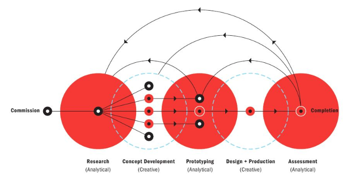
During the Defining Client Needs class I developed multiple sketches with the goal of designing a logo that will attract tourism to the city of Kyoto, Japan. Throughout this project research has become the most important part of the creative process.
The commission was to choose either the city of Kyoto, Marrakesh, or Reykjavik and design a logo promoting tourism. Knowing the commission, my next step was to conduct research on each of the cities under the categories of culture, tradition, and geography. This research led me into the start of the concept development process, in which I recollected all the researched data and added it into a total of nine mind maps (three mind maps per city). I concluded this step by highlighting the concepts that I believed were going to be the most useful for the rest of the project.
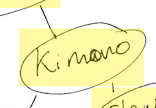
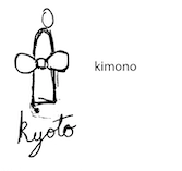
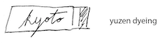
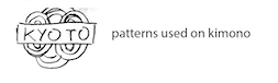
After creating the mind maps I decided to choose Kyoto as my subject for the final design, and I started the prototyping process. Through this process I made over seventy five sketches based on the information found on the mind maps and on David Airey’s elements of iconic design. While prototyping, the mind maps became essential to start sketching, yet i would run out of ideas and was forced to go back into deeper research in order to come up with more unique sketches. An example of that took place during the sketching of “kimonos”. After making a sketch about kimonos I went back into research and found that Kyoto has a special type of dye system that is used for the coloring their kimonos. After even deeper research I found that some kimonos have specific patterns printed into them. This extra research gave birth to more specific and unique sketches.
Now I am in the design and production phase. As of now I have submitted my sketches for peer review and criticism. I hope to receive enough constructive feedback that will lead me into choosing a couple of prototypes to refine and come up with some preliminary sketches. From there I will be choosing a final design and will complete it by first comparing it to my previous research, my developed concepts, and prototypes in order to make it the best that it can be.
My process according to A Designer’s Research Manual: Succeed in Design by Knowing Your Clients and What They Really Need, by Jennifer Visocky O’Grady and Ken O’Grady:
During this month this month I received criticism from both my sketches and design process. Though both criticisms complimented my designs, they also coincided in one major fault. When doing my research I focused mostly on what makes Kyoto unique from the rest of Japan and how to use that information to express the exclusivity of the region in the field of tourism. While that research became base for unique concepts, I conducted little research on the consumers and what demographics tour Kyoto the most. This lack of research became apparent in my sketches, delivering designs mostly approachable to western culture rather than Asian culture.
In the future I will make sure to separate my research into sections and cover each area one by one rather than all of it together. I will make sure to make separate research in each of the topics of the brand, the consumer, and the product. I will also create personas in order to design specifically for the demographic that the design needs to impact.
References:
Airey, D. (2015). Logo design love: a guide to creating iconic brand identities. Berkeley, Ca.: New Riders.
OGrady, V., & Jennifer. (2009). Designers Research Manual: Succeed in Design by Knowing Your Clients and What They Really Need.
This month the book Logo Design Love: A Guide to Creating Iconic Brand Identities, by David Airey was key for the brainstorming and sketching process of our logos. Chapter 7 had information on creating mind maps, while Chapter 3 had information on the seven elements of iconic design.